![[Stable]](figures/lifecycle-stable.svg)
Usage
h_set_nest_theme(font_size)

h_g_ipp(
  df,
  xvar,
  yvar,
  xlab,
  ylab,
  id_var,
  title = "Individual Patient Plots",
  subtitle = "",
  caption = NULL,
  add_baseline_hline = FALSE,
  yvar_baseline = "BASE",
  ggtheme = nestcolor::theme_nest(),
  col = NULL
)

g_ipp(
  df,
  xvar,
  yvar,
  xlab,
  ylab,
  id_var = "USUBJID",
  title = "Individual Patient Plots",
  subtitle = "",
  caption = NULL,
  add_baseline_hline = FALSE,
  yvar_baseline = "BASE",
  ggtheme = nestcolor::theme_nest(),
  plotting_choices = c("all_in_one", "split_by_max_obs", "separate_by_obs"),
  max_obs_per_plot = 4,
  col = NULL
)
Arguments
- font_size
(
number)
text font size.- df
(
data frame)
data set containing all analysis variables.- xvar
(
string)
time point variable to be plotted on x-axis.- yvar
(
string)
continuous analysis variable to be plotted on y-axis.- xlab
(
string)
plot label for x-axis.- ylab
(
string)
plot label for y-axis.- id_var
(
string)
variable used as patient identifier.- title
(
string)
title for plot.- subtitle
(
string)
subtitle for plot.- caption
(
characterscalar)
optional caption below the plot.- add_baseline_hline
(
flag)
adds horizontal line at baseline y-value on plot when TRUE.- yvar_baseline
(
string)
variable with baseline values only. Ignored whenadd_baseline_hlineis FALSE.- ggtheme
(
theme)
optional graphical theme function as provided byggplot2to control outlook of plot. Useggplot2::theme()to tweak the display.- col
(
character)
lines colors.- plotting_choices
(
character)
specifies options for displaying plots. Must be one of "all_in_one", "split_by_max_obs", "separate_by_obs".- max_obs_per_plot
(
count)
Number of observations to be plotted on one plot. Ignored whenplotting_choicesis not "separate_by_obs".
Details
Line plot(s) displaying trend in patients' parameter values over time is rendered. Patients' individual baseline values can be added to the plot(s) as reference.
Functions
h_set_nest_theme(): sets aggplotgraphical theme to control outlook of plot.h_g_ipp(): helper function that generates a simple line plot displaying parameter trends over time.g_ipp(): depending on user preference, renders a single graphic or compiles a list of graphics that show trends in individual's parameter values over time.
Examples
library(scda)
library(dplyr)
library(nestcolor)
# Select a small sample of data to plot.
adlb <- synthetic_cdisc_data("latest")$adlb %>%
filter(PARAMCD == "ALT", !(AVISIT %in% c("SCREENING", "BASELINE"))) %>%
slice(1:36)
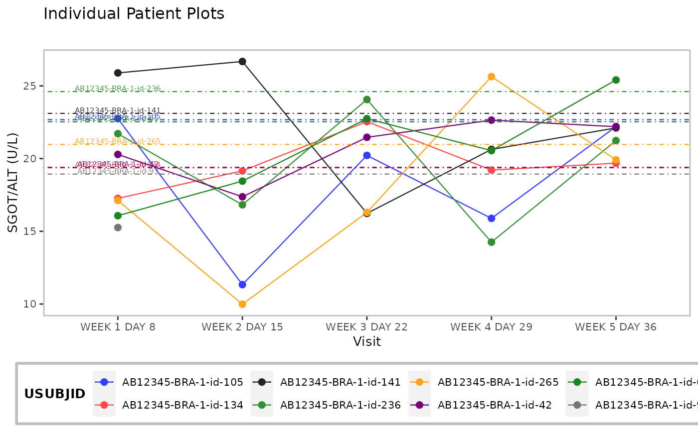
p <- h_g_ipp(
df = adlb,
xvar = "AVISIT",
yvar = "AVAL",
xlab = "Visit",
id_var = "USUBJID",
ylab = "SGOT/ALT (U/L)",
add_baseline_hline = TRUE
)
p
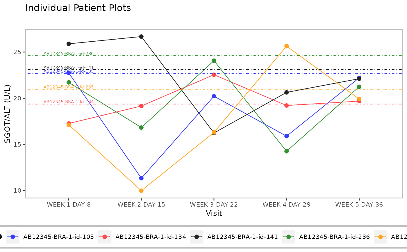
 plot_list <- g_ipp(
df = adlb,
xvar = "AVISIT",
yvar = "AVAL",
xlab = "Visit",
ylab = "SGOT/ALT (U/L)",
title = "Individual Patient Plots",
add_baseline_hline = TRUE,
plotting_choices = "split_by_max_obs",
max_obs_per_plot = 5
)
plot_list
#> [[1]]
plot_list <- g_ipp(
df = adlb,
xvar = "AVISIT",
yvar = "AVAL",
xlab = "Visit",
ylab = "SGOT/ALT (U/L)",
title = "Individual Patient Plots",
add_baseline_hline = TRUE,
plotting_choices = "split_by_max_obs",
max_obs_per_plot = 5
)
plot_list
#> [[1]]
 #>
#> [[2]]
#>
#> [[2]]
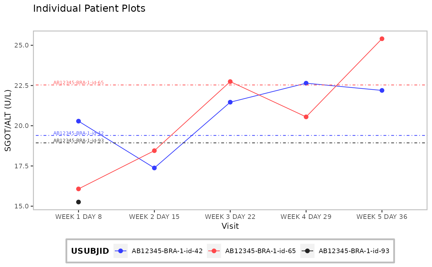 #>
#>